Tutorial
Master Text Styles in Framer

Using Text Styles in Framer
Styles are reusable visual properties that define the appearance of text, including font, size, and color. They enable centralized management of text appearance across your site.
Applying and Creating Styles
By default, all text is unstyled. To apply a style:
Select a text element or specific text.
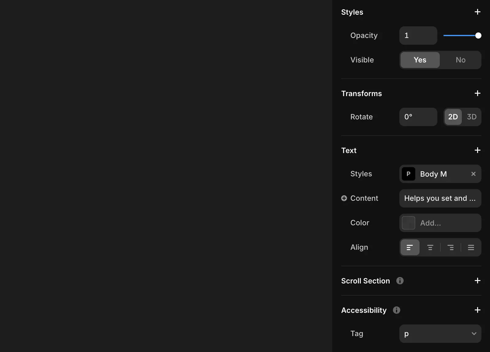
Click Text → Styles in the properties panel.
To remove a style, click the × in the properties panel.
Adding Breakpoints
Text styles can adapt to different device sizes using breakpoints:
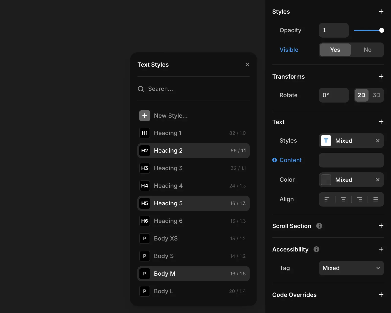
Click on a text style to open the Edit Style modal.
In the Breakpoints section, click Add Breakpoint to add defaults for Desktop (L), Tablet (M), and Mobile (S).
Customize font size, line height, letter spacing, and paragraph spacing for each breakpoint.
Managing Styles
To manage styles:
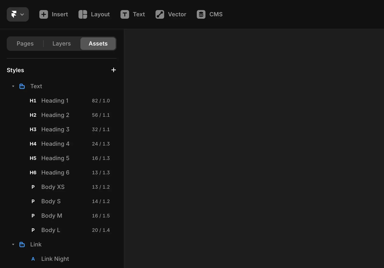
Go to Assets → Styles in the left panel.
Create, edit, or delete styles as needed to fit your project requirements.
Rich Styled Text
You can apply multiple styles to a single text element using Markdown. To customize specific text within an element:
Select the text you want to modify.
Apply the desired style in the properties panel.
CMS Text Styles
Text styles for CMS elements work the same way. In the properties panel, select any available style for your CMS text elements.
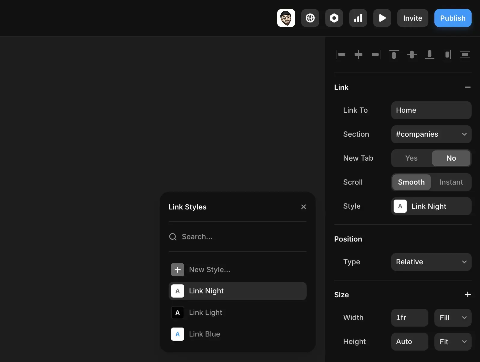
Link Styles
To style links:
Select a text layer and navigate to the Link row.
Adjust the Style property to apply link-specific styles.
Customize states such as hover, active, and current.
Override Colors
To emphasize specific text within a style:
Apply the desired text style.
Select the specific text you want to modify.
Use the properties panel to override the color without creating a new style.
Setting Text Style Breakpoints
Text style breakpoints allow your text styles to adapt to different screen sizes by adjusting font size, line height, and other typographic settings across Desktop, Tablet, and Mobile devices.
Creating Text Style Breakpoints
To get started with responsive text styles:
Open the Assets tab on the left-hand side.
Navigate to the Styles section.
Click on any text style to open the Edit Style modal.
Under the Breakpoints heading, click the Add Breakpoints button.
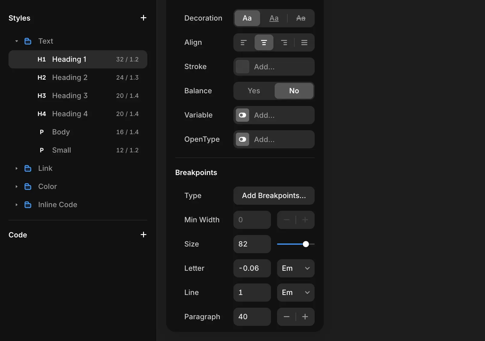
You’ll see three default breakpoints added:
Desktop (L)
Tablet (M)
Mobile (S)
Once these are added, you can customize the typography for each breakpoint. Adjust properties like:
Font size
Line height
Letter spacing
Paragraph spacing
This gives you full control over how your text looks across devices, ensuring consistent and readable typography no matter the screen size.
Jun 13, 2025
More Articles